HTML Content - Custom Visual for Power BI
Data Roles Reference
Data Roles Reference
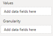
HTML Content has 2 data roles ("fields", "buckets", "wells"...) that you can use to add columns or measures from your data model to affect the resulting output of the visual in your report:

Values
The Values data role accepts either a column or measure that you wish to use to generate the visual's output.
If the column or measure contains valid HTML, then the visuall will render this for you.
Using Columns
If using a column, the visual will use all distinct values passed into its data view by Power BI. For example, the column we use to create a country flag in our simple walkthrough, will generate row context for each value:

Using Measures
If using a measure, the visual only has context for that particular value, e.g.:

You can introduce row context by either:
Adding columns to the Granularity data role (detailed below) so that the measure evaluates as desired.
Using table variables in your measure to create a result set that you can flatten down to a single, continuous value of HTML. The simple example illustrates this concept if you wish to explore further.
Granularity
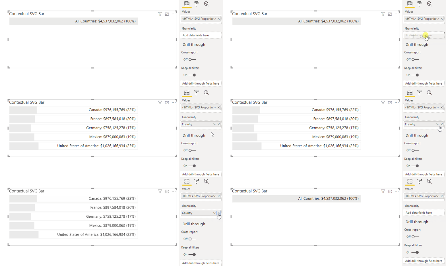
The Granularity data role is used to generate additional row context using one or many columns, without adding the value of those columns to the visual output.
This is useful if you want to add a single measure to the Values data role, but generate HTML for a specific level of granularity.
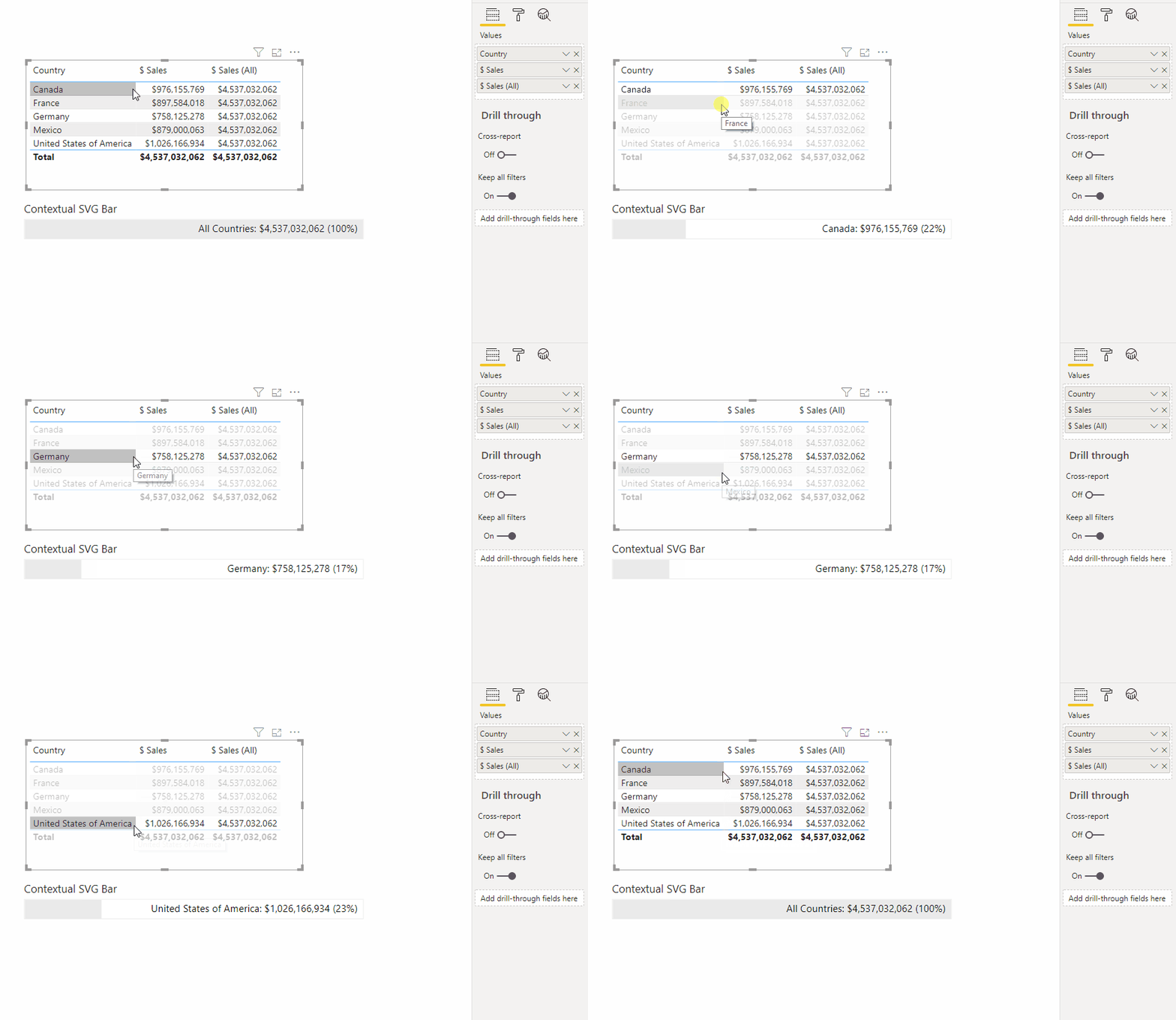
In the example above we started by adding the [$ Sales] measure to our visual and this results in a single value. But, let's say we want to create a measure that produces richer output based on [$ Sales] and a measure that includes all sales, e.g.:
Sales (All) = CALCULATE( [$ Sales], ALL(Financials))If we create a table and add the [$ Sales] and [$ Sales (All)] measure, we can see the effect this has on row context for each measure.
We could now create a measure that generates some SVG that will shade based on a proportion of sales vs [$ Sales] and [$ Sales (All)] and check the current context, e.g.:
<HTML> SVG Proportion of Sales = VAR ContainerWidth = 500 VAR ContainerHeight = 30 VAR SelectedCountry = SELECTEDVALUE ( Demographic[Country] ) VAR CountryCaption = IF ( SelectedCountry <> "", SelectedCountry, "All Countries" ) VAR TotalSales = FORMAT ( [$ Sales], "$#,##0" ) VAR SalesPercent = DIVIDE( [$ Sales], [$ Sales (All)] ) VAR SalesPercentFormatted = FORMAT( SalesPercent, "#%") VAR SalesWidth = ContainerWidth * SalesPercent RETURN "<svg height='" & ContainerHeight & "' width='" & ContainerWidth & "' style='border: 1px solid #eaeaea'> <rect width='" & SalesWidth & "' height='" & ContainerHeight & "' style='fill: #eaeaea;'/> <text text-anchor='end' dominant-baseline='middle' x='" & ContainerWidth - 10 & "' y='" & DIVIDE( ContainerHeight, 2 ) & "'>" & CountryCaption & ": " & TotalSales & " (" & SalesPercentFormatted & ")" & "</text> </svg>"If we add this measure, we get some context-awareness as we click on the table's rows to look at a specific country, e.g.:

Or, we could add the [Country] column to the Granularity data role and get one bar per row, without including that value in our output:

- Multiple columns can be added to Granularity if you want to further extend the row context to suit your use case.